
ANESSA
Skincare Sunscreen
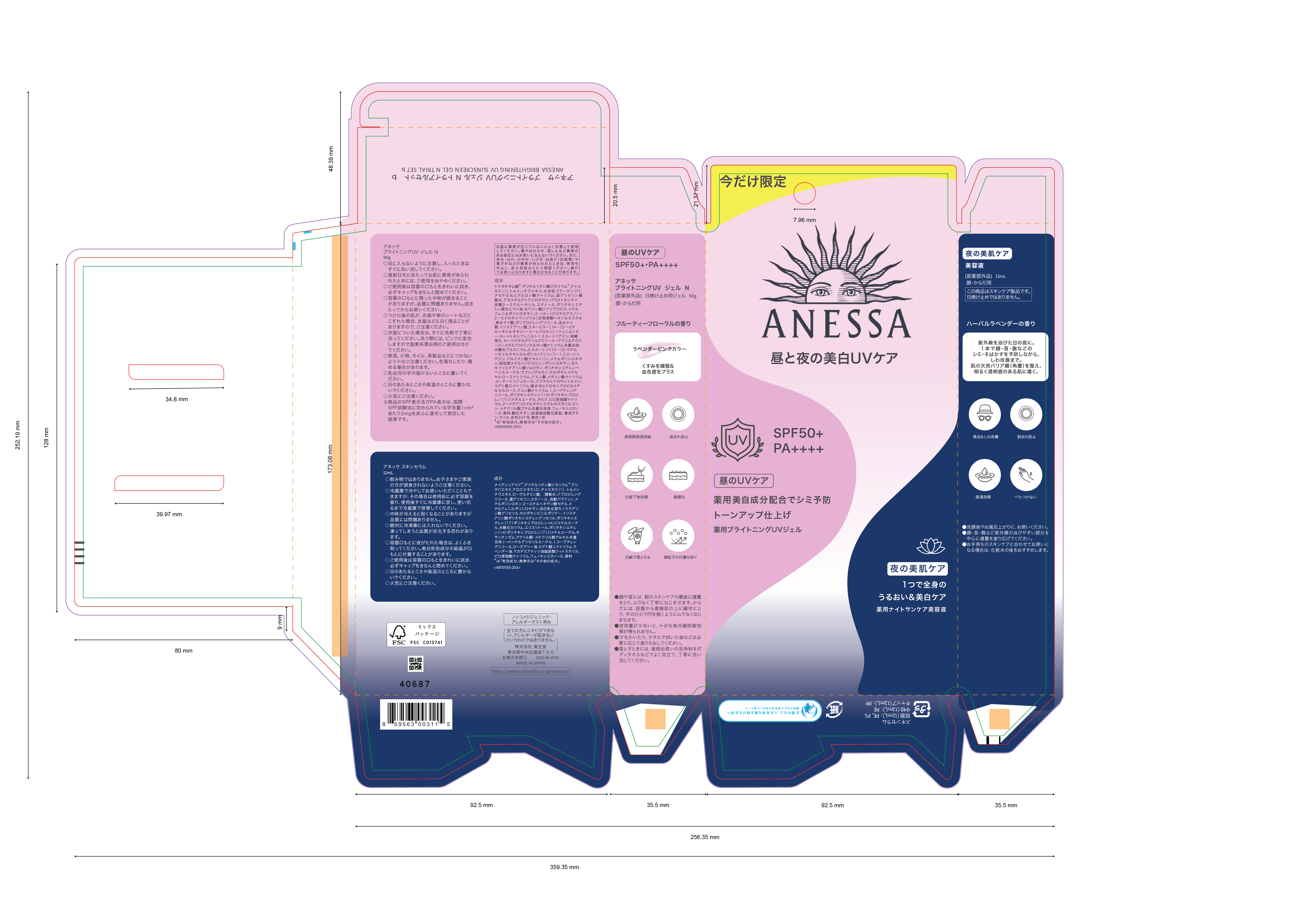
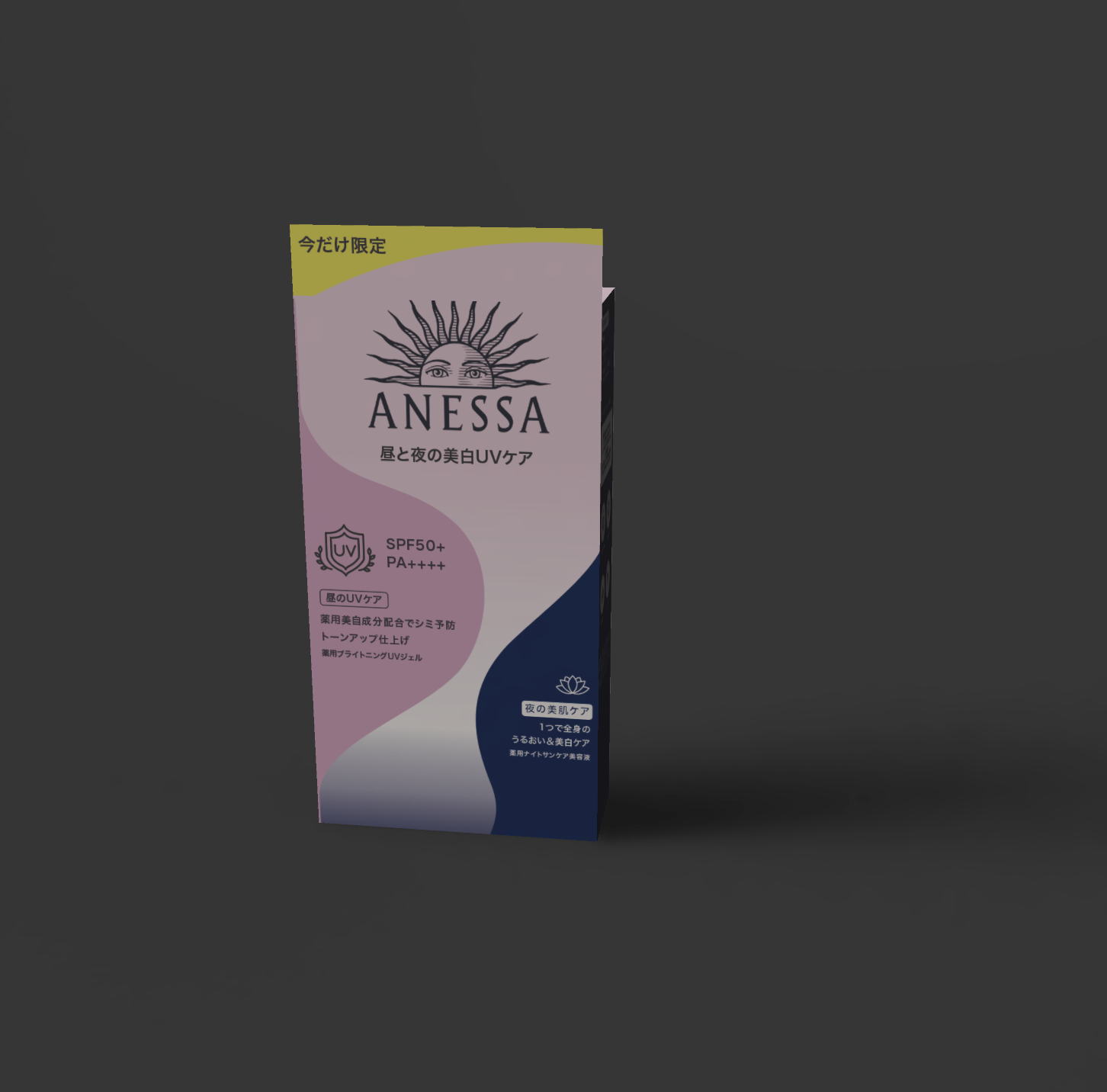
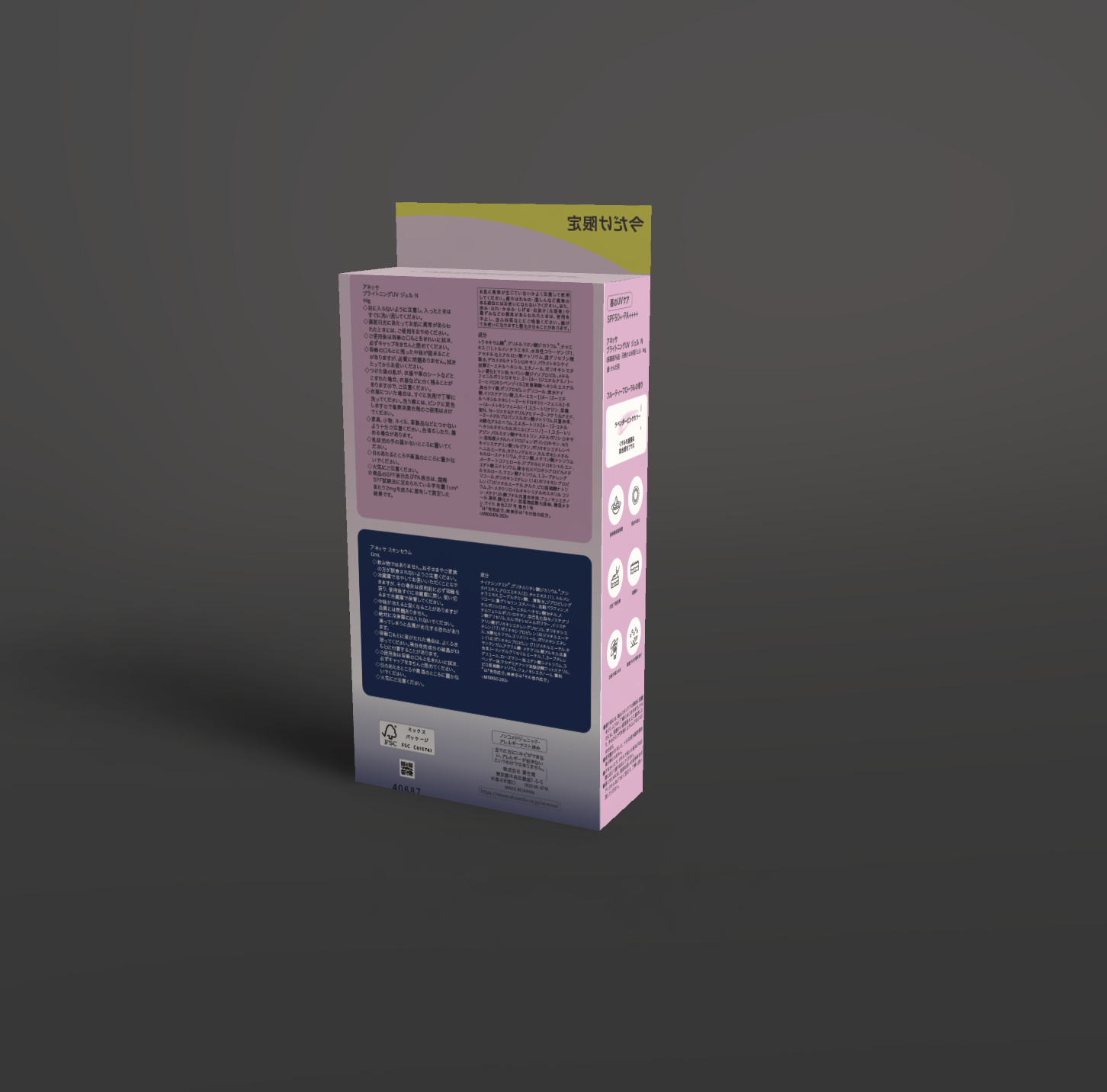
The original packaging used excessive text, making key information hard to grasp. Research from Nielsen (2019) shows that reducing cognitive load and using icons improves engagement, so I simplified the layout by replacing text with icons and organizing content for two products.
Based on insights from Dotcom Distribution (2021) and user behavior, I prioritized SPF and PA ratings by removing front images and emphasizing key details. Ingredients, warnings, and instructions were moved to a structured back layout with color differentiation, improving clarity, accessibility, and overall user experience.
- Year
- 2025
- ANESSA / Academic Redesign
- PackagingBrandingCase Study
Next Story
KIRANY Sparkling Water